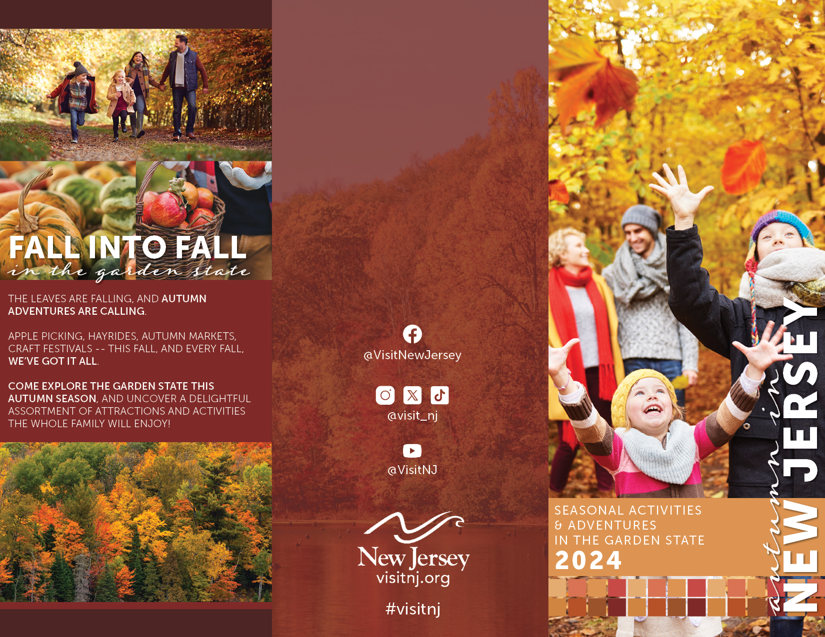
A print project that includes a hypothetical spread in an official New Jersey tourism magazine, as well as an accompanying brochure for public distribution. Deep, rich reds, golds, and browns combine to create a cornucopia of autumn colors, reflecting the splendor of New Jersey autumns. Typography selections include bold typefaces paired with handwritten scripts which, when implemented alongside an array of autumnal photography, creates a scrapbook-like effect.
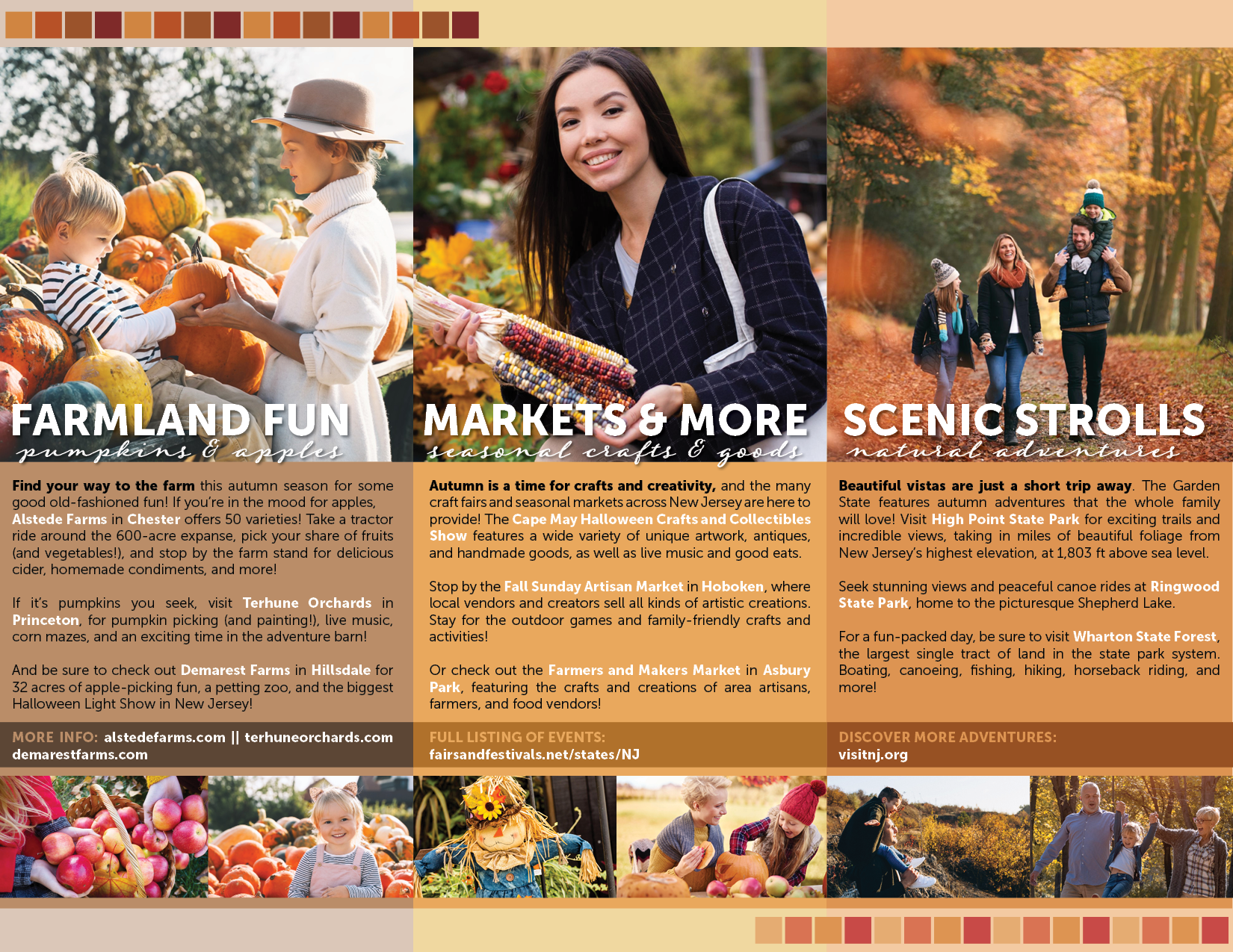
The accompanying brochure reformats the textual components from the main spread into separate columns, complete with relevant photography and seasonal color coordinating.